Migrating a Design System Safely with Visual Regression Testing
Web | July 15, 2026
Introduction
At work, I migrated a legacy UI to a new design system and used type checking and visual regression testing to verify each change. Components from both libraries were still in use, so we needed to reduce the legacy dependency gradually.
We could not simply replace the imports because each component exposed a different API. Even when the code passed type checking, the layout could still change. We therefore migrated components one file at a time, then ran type checks and visual regression tests in sequence.
This post covers the problems we encountered and the workflow we used to validate the migration. To distinguish the examples from our internal implementation, I refer to legacy components as Legacy* and simplify some names and code without changing their essential meaning.
Similar names do not mean identical components
Even when two components had similar names and responsibilities, they accepted props with different names and structures.
For example, LegacyBox combined multiple layout settings into a single string prop.
<LegacyBox flow="row wrap" align="center space-between" />
In the new design system, Flex expressed each responsibility with a separate prop.
<Flex
  direction="row"
  wrap="wrap"
  align="center"
  justify="space-between"
/>
The flow prop became direction and wrap, while align was split into align and justify. Differences like these ruled out a simple bulk replacement of imports.
Some legacy components were even more complicated because they mapped to multiple components in the new system.
| Legacy component | New component | Selection criteria |
|---|---|---|
LegacyBox | Flex | Split a single string prop into props with distinct responsibilities |
LegacyTooltip | Tooltip / HoverCard | Choose based on whether the content is a short definition or detailed guidance |
LegacyTag | Badge / Chip | Choose based on whether the element displays a status or supports interaction |
For example, we replaced a read-only LegacyTag with Badge and used Chip when users could click or select it. We also moved short descriptions from LegacyTooltip to Tooltip and multiline guidance to HoverCard.
This led to one guiding principle: choose the new component based on the UI's meaning and interaction, not the shape of its existing props.
Define rules by component, migrate by file
We first documented conversion rules for each component type, such as LegacyBox, LegacyButton, and LegacyTag. The actual migration unit, however, was a file rather than a component type. If a file used several legacy components, we applied the corresponding rules to each one, cleaned up its imports and type errors, and only then moved to the next file.
The workflow was as follows:
- Find legacy imports and their usages in the target file.
- Apply the prop conversion rules for each component.
- Replace the imports with those from the new design system package.
- Confirm that no legacy components remain and remove empty legacy imports.
- Run
tsc --noEmitto check types. - Manually fix cases that the rules could not cover, such as dynamic props or components without a one-to-one replacement.
- Run the formatter.
- Create as-is and to-be stories, then validate the visual changes with Playwright screenshots and pixel diffs.
- Trace the component to the page where it is used and record the URL, location, and access requirements.
Type checking quickly exposed missed prop conversions. In some cases, for example, text previously passed through a prop had to become children in the new component. We used the resulting type errors to correct dynamic props and component branches that could not be handled by predefined rules.
Type checking alone was not enough, however. Swapping align and justify could still produce valid values and compile successfully. Changes to component height or spacing would not cause a type error either. Type checking could tell us whether the API usage was valid, but not whether the screen still looked the same.
Compare both UIs under the same conditions
To compare the before and after states reliably, both had to render under the same conditions. We used a feature flag to switch between the legacy UI (as-is) and the new UI (to-be).
return isDesignSystemMigrationEnabled
  ? <NewComponent />
  : <LegacyComponent />;
Because we could compare both versions in the same build by changing only the flag, we reduced variables caused by differences in data or surrounding UI. If we found an unexpected issue, we could also turn off the flag and return to the legacy UI.
Manually comparing production screens, however, was time-consuming and produced inconsistent results between reviewers. We used Storybook and Playwright to make the comparison repeatable.
Reproduce usage context, not just the component
Capturing an isolated button can reveal differences in its color or size. In migrations, however, a more common problem is a layout regression that pushes the surrounding elements out of place.
Our VRT stories therefore included more than the component being migrated. We reproduced its parent container, siblings, spacing, and alignment from the original file. Dependencies that were unnecessary in Storybook, such as store values or translations, were replaced with fixed values, while the component's visual context remained intact. We then created an as-is story with the legacy component and a to-be story with the new component in the same context.
Each story also recorded:
- The original file path
- The actual page's URL pattern and an example URL
- The component's location on the page
- Access requirements, such as authentication or specific data
- The associated feature flag
This metadata provided a path back to the actual screen after we found a diff. Instead of stopping at “the images are different,” we could immediately identify which page and state needed further inspection.
We also created a dedicated Storybook configuration that loaded only migration stories. This avoided story ID conflicts with the main Storybook and limited the test scope to migrated UI.
Generate pixel diffs, then inspect where they occur
We captured the as-is and to-be states with Playwright's toHaveScreenshot(). We then used ImageMagick's compare command to generate pixel diffs and calculate the number and percentage of changed pixels.
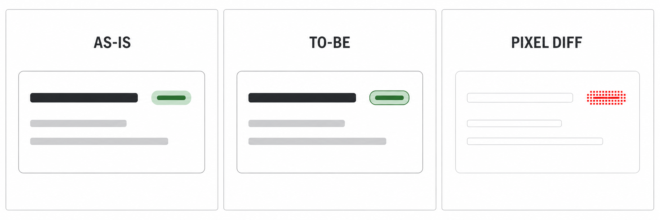
As in this example, we checked whether the diff remained within the target component.
Render the as-is and to-be states in Storybook
                     ↓
Capture both screenshots with Playwright
                     ↓
Generate a pixel diff with ImageMagick
                     ↓
Record the location and percentage of changes
                     ↓
Verify the result on the actual service page
Rather than capturing the full page, we captured only the #storybook-root > div element. If we calculated the change ratio against an entire page, a small component difference could disappear within a large empty area. Limiting the screenshot to the relevant UI context made even small alignment changes visible.
When reviewing a result, we looked at the location of the diff before its percentage.
| Diff location | Decision |
|---|---|
| No difference | Visually identical to the legacy UI |
| Difference contained within the target component | Check whether it is an intentional color, font-weight, or other design-system change |
| Difference extends to spacing, alignment, or surrounding text | Treat it as a layout regression and fix it |
We used the change percentage as a supporting metric for prioritization. A difference below 1% could come from subpixel rendering or anti-aliasing. At 1% or more, we investigated the cause; at 5% or more, we checked for layout regressions first.
The percentage alone did not determine whether a result passed or failed. A small diff outside the target component could still indicate a problem. A larger diff contained entirely within the component, on the other hand, could be acceptable if it reflected an intentional change in the new design system.
For each comparison, the VRT report recorded the original file, URL, screen location, changed pixel count, and change percentage. For results with a difference of 1% or more, we also documented the diff image, its cause, and whether the change was acceptable.
Verify the actual service page last
Storybook is useful for controlling comparison conditions, but it cannot represent every state in the actual service. After the VRT run, we therefore found the page where each migrated component was rendered and verified it there.
We started with the component exported from the changed file and traced its parents until we reached a route. We then looked up the URL pattern in the route configuration and documented its dynamic parameters, position on the page, and access requirements, such as authentication or specific data.
This step made the same screen reproducible for other developers. A file path alone would require them to trace the code again. A URL, location, and access requirements let them navigate directly to the screen in question.
Turn repeated decisions into migration rules
We documented the decisions we made so that we would not have to make them again for every file. The document covered more than prop mappings. It also included:
- Selection criteria for components such as
LegacyTagandLegacyTooltip - Cases that were difficult to automate, such as dynamic variants and sizes
- Type-checking and formatting steps
- Rules for writing Storybook stories and running VRT
- How to find and report the actual page URL
- Common mistakes and verification items
For each new file, we started with these rules. When a type error or visual diff revealed a new edge case, we added it back to the document. As the migration progressed, the number of decisions required for the next file decreased.
Conclusion
Type safety and visual safety were separate concerns in this design system migration. Type checking caught invalid API conversions, while Storybook stories that reproduced the real usage context and Playwright VRT revealed layout changes that types could not detect. Feature flags allowed us to compare both UIs under the same conditions and return to the legacy UI when necessary.
The most effective decision was making this validation part of the file-level workflow. Instead of stopping after replacing legacy imports, we checked the types, inspected where pixel differences occurred, and verified the result on the actual page. We then turned what we learned into reusable rules.
This process let us repeat the migration safely in small increments. A safe design system migration requires not only a plan for what to replace, but also a clear sequence and criteria for validating the result.